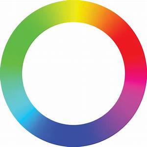
Colors with huge differences in hue, lightness, and brilliance are called contrasting colors. The two colors within 120° ~ 180° adjacent to each other in the hue circle are contrasting colors. Among the three primary colors red, green and blue, red and green, green and blue, and blue and red are mutually contrasting colors. Among the three complementary colors, yellow, magenta, cyan, yellow and magenta, magenta and cyan, and cyan and yellow are mutually contrasting colors. Among the complementary colors, red and cyan, green and magenta, blue and yellow are contrasting colors. In the composition, juxtaposition of contrasting colors can achieve a strong and vivid visual effect.
People's visual psychological perception of color
constitutes the basis of color theory. Color psychology is closely related to
people's associations, and it is the psychological precipitation of people in
long-term life practice. The psychological effect of color has a certain
universality.
Different colors give people different psychological
feelings. There are mainly the following categories:
Cold and warm. Cyan, blue, and purple are called cool
colors. Cool colors give people a cool psychological feeling and make people
feel comfortable. Red, orange, and yellow are called warm colors, which make
people feel warm.
Soft and hard feeling. Light colors (such as white, pink)
have a soft feeling. Dark colors (black, purple) have a harsh feel.
A sense of movement. Dynamic colors are called dynamic
colors. Generally speaking, colors with high saturation, high brightness, and
low color temperature (such as red, orange, and yellow) can easily make people
feel psychologically dynamic. Colors with a sense of calm are called static
colors. Generally speaking, colors with low saturation, low brightness, and
high color temperature (such as blue, purple, and gray) tend to make people
feel calm in their minds.
sense of rhythm. Different hues, lightness, and brilliance
colors, periodic, interval, alternating and repetitive changes will produce a
sense of rhythm.
Sense of weight. White, light color, bright toning, and cold
toning make people feel brisk. Black, dark, dark and warm colors make people
feel heavy.
Tension and shrinkage. The warm color has a sense of
expansion. Cool colors have a sense of shrinkage.
Sense of time. People watching green for a long time will
not cause discomfort. Looking at red for a long time will be upset. It will be
uncomfortable to watch purple for a long time.


Comments
Post a Comment
Please enter a comment...